There's a recurring failure mode we see when carriers evaluate their driver app setup: route updates that are technically correct arriving in a form that drivers can't act on safely while operating a vehicle.
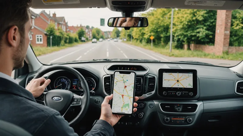
The software computed the right answer. The API delivered the update. The app rendered it accurately. And the driver, merging onto I-35 at 41 mph, glanced at a full route list reload and missed the change entirely.
Driver app UX for route updates is a problem distinct from route optimization quality. You can have the best re-sequencing algorithm on the market and waste most of its operational value if the update arrives in a format that demands cognitive processing the driver can't safely perform in motion. This is the problem most carriers haven't fully solved.
The Core UX Failure: Treating Drivers as Desktop Users
Most route apps were initially designed — or initially evaluated — in a desk or static-vehicle context. They display route lists, clickable stop cards, map views, and notification panels. These interfaces work fine for pre-route review during the loading window at the depot.
They fail in motion for two structural reasons.
First, the information density is wrong. A notification that says "Route updated: 3 stops resequenced" communicates nothing actionable. The driver has to tap the notification, load the route view, find the change indicator, and compare the new sequence to what they were executing. That's a 4-step cognitive operation that requires looking at the screen for 8–12 seconds — which is 8–12 seconds not watching the road. NHTSA research on manual-distraction events consistently shows that secondary task glance durations above 2 seconds are associated with meaningfully elevated collision risk.
Second, the decision prompt is wrong. Many route apps present an update as an accept/reject prompt: "New sequence available. Accept?" At 40 mph, requiring a driver to make an explicit binary decision about whether to accept a navigation change is asking for exactly the wrong thing at exactly the wrong time. The driver either blindly accepts (which means they don't understand what changed), blindly rejects (which means the update is lost), or tries to review the change to make an informed decision (which means they're looking at their phone for too long).
The Right Design Principle: Zero-Decision Updates
The UX principle we built Parcelarc's driver app around is what we call zero-decision delivery: a re-sequencing update should arrive in a form that the driver does not have to consciously decide to accept. The updated sequence takes effect automatically, and the only driver-facing output is a minimal, audio-first notification indicating what their next stop is now.
This works because the decision about whether to accept the update has already been made — by the dispatch console, which reviewed the re-optimization output before it was pushed. The dispatcher (or the automated exception threshold rules set up in the Parcelarc console) made the accept/reject decision at the operations-desk level, with full visibility into the route delta. What reaches the driver is an instruction, not a question.
The practical implementation: when a re-sequencing update is pushed to the driver app, the primary driver interface — the current-stop card and next-stop preview — updates silently. A brief audio tone and a single-line display notification ("Route updated — next stop changed to 1847 Greenview Dr") plays once. The full route list reflects the new sequence. No tap required, no confirmation modal, no map reload. The driver's navigation continues to the new next-stop address.
What Carriers Get Wrong: The Modal Interrupt
The most common UX mistake we see in carrier-deployed or off-the-shelf driver apps is the modal interrupt for route changes. A modal is a pop-up overlay that requires user interaction before the app continues. It's a reasonable pattern for a desktop application where a user is stationary and attentive. It's an operational hazard in a vehicle.
A modal interrupt for a route update means the driver's navigation — and the navigation audio — is suspended until the driver interacts with the prompt. In practice, drivers learn to tap "accept" without reading, which defeats the purpose of showing the modal at all. Or they pull over to read it, which adds 3–5 minutes to the route. Or they dismiss it to deal with later and proceed on the old sequence, which means the update didn't take effect.
We're not saying modal prompts are bad interface design in general. We're saying they are the wrong pattern for a real-time update delivered to a moving vehicle operator. The context demands different design conventions than standard mobile app development assumes.
Platform apps like Onfleet and Bringg have both iterated on this problem and their current versions handle update delivery more gracefully than early implementations. The lesson is that the design principle — put route update intelligence in the dispatch layer, minimize driver decision burden — needs to be explicit, not just hoped-for from a general-purpose app.
Exception Stops: Where the UX Bar Is Higher
Not every re-sequencing update can be zero-decision. Some updates involve genuine driver decisions: a stop marked with a known access restriction, an address flagged as requiring signature confirmation that the re-sequence hasn't changed, or a stop that was re-routed to a different service area that the driver hasn't visited before.
For these, the right pattern is a designated review moment — not in motion, but at the next completed stop while the driver is stationary and unloading. The app should queue exception-review items for the natural stop dwell time, presenting them in a structured format: "1 route exception waiting — review at next stop." When the driver completes the current stop and is parked and stationary, the exception review card becomes available. It shows exactly what needs a decision and why, with the minimum information required to make it.
Carriers who have implemented this pattern report that drivers actually read the exceptions at stop dwell time — because there's no cognitive cost to reviewing information while unloading a van. The same information presented as a modal at 40 mph gets dismissed or ignored. Context determines whether information is processed or discarded.
The Dispatch Console Counterpart
Driver app UX improvements only work if the dispatch console keeps dispatchers informed about what updates were pushed and what the driver acknowledged. If a dispatcher pushes a route update but has no visibility into whether the driver's app applied it, the operational value is uncertain.
The console-side requirement: after a route update is pushed, the dispatch map should show the updated route sequence for each vehicle, with a timestamp for when the update was delivered to the driver app and when the driver reached the updated next-stop. If the driver's next actual movement diverges from the updated sequence — indicating the update may not have been applied — the console should flag the discrepancy within 3–5 minutes.
This closes the loop. The dispatcher doesn't need to call the driver to confirm the update was received; the route behavior confirms it. When divergence is detected, the dispatcher can make a direct call — one targeted interaction, not routine check-in calls that interrupt driver attention on every route.
The Parcelarc platform overview covers how the dispatch console and driver app are designed as a paired system for this update-loop visibility. For carriers evaluating how this fits with their existing fleet telematics and ELD setup, the integrations page covers the data connections that make real-time position tracking and HOS awareness work inside the re-sequencing pipeline.